Which Cohorts Predict the Future of Your Business?
Hi, I’m Kyle Kelly. Each week Line of Sight breaks down how AI, strategy, and revenue growth architecture turn complexity into leverage.
Cohort analysis is supposed to be descriptive, not predictive.
But if you’re the kind of operator who looks for signal in the noise, hear me out.
When you segment by behavior instead of time, patterns emerge early.
You start to see velocity breaks, those moments when one cohort accelerates faster than the rest.
That’s where future growth opportunities hide.
This week’s Line of Sight breaks down how to turn cohorts into a predictive system for growth.
What if you could predict the future of your business? Not with a crystal ball, but with data you already have.
Most startups use cohort analysis to look backward. They measure last quarter’s churn & last year’s LTV. It’s useful, but it’s history.
But what if you used cohort analysis as a forward-looking sonar? To find the hidden pockets of growth & the unseen risks before they surface. That’s what the best operators do. They don’t just report the news. They use data to make the news.
What is Cohort Analysis? An Analogy
Imagine you’re a farmer. You plant a new field of corn every month. Each field is a cohort.
At the end of the year, you don’t just measure the total yield. You ask:
Which month’s planting produced the most corn? (Maybe the May cohort got the perfect amount of rain).
Did the corn planted in July (the July cohort) suffer from the summer heat?
Did the new fertilizer I used in September make that cohort grow faster?
Cohort analysis is just like that. Instead of fields of corn, you have groups of customers. You group them by a shared characteristic (usually when they signed up) and you track their behavior over time. It helps you see patterns you’d otherwise miss.
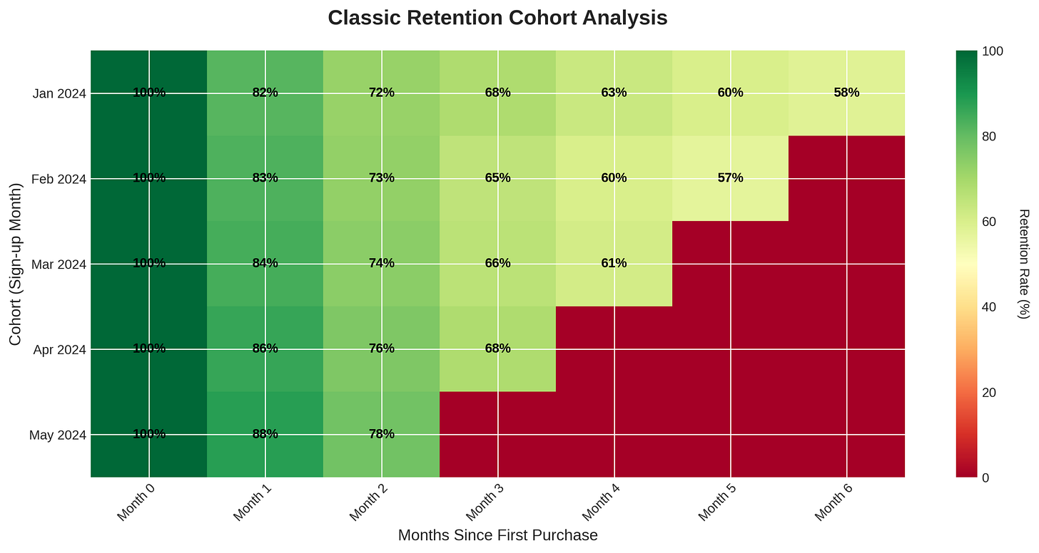
This is what a retention chart looks like. It’s the farmer’s almanac for your business.
This chart shows the percentage of customers from each monthly cohort who are still active over time. You can see the January cohort started strong, but the May cohort had better retention in its first few months. Why? That’s the question that leads to strategic insights.
Finding the Velocity Break
A B2B SaaS company I know provides a great example. They sell a data integration tool. For years, they sold to large enterprises. Their cohorts looked great. High retention, low churn. Predictable, linear growth.
But the leadership team suspected there was a hidden story in the data. They started segmenting cohorts differently. Not by sign-up date, but by what customers did first.
They found a small cohort of users who weren’t using the core enterprise features. Instead, they were using the tool for a much simpler task: blending data from a few sources. These users were in smaller, faster-moving companies.
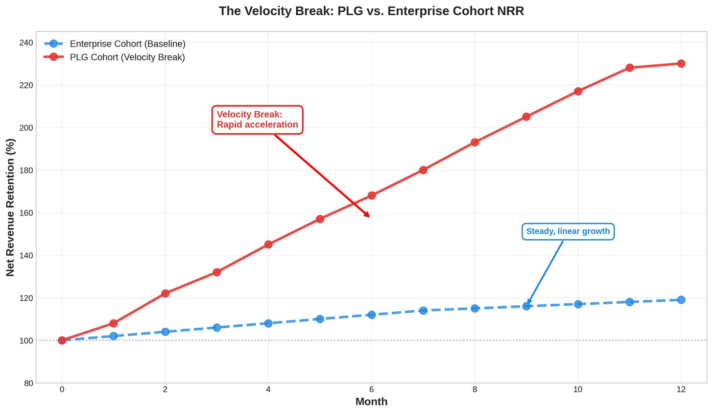
When they isolated this cohort, they saw something startling. Look at the chart below.
The enterprise cohort (in blue) has solid net revenue retention (NRR). It grows steadily over time. But the new PLG cohort (in red) is a rocket ship. Its NRR explodes after a few months. This is a velocity break. A velocity break is when a key metric, like NRR, suddenly accelerates. It’s a sign you’ve found a new, more efficient growth engine.
Of course, not every spike is real. Some “velocity breaks” are just noise. The real signal comes when that acceleration pattern repeats across multiple periods. Prediction comes from behavior-based cohorts, not one lucky anomaly.
This one chart changed the company’s strategy. They built a new, stripped-down version of the product for this PLG use case. They launched a freemium plan. A whole new revenue stream opened up, growing much faster than their core enterprise business.
This is the power of looking at cohorts differently. You find the future in the outliers.
Three Cohorts That Predict the Future
So how do you find these velocity breaks? By looking at three types of cohorts:
1. Customer Cohorts: The Truth About Your Product (B2B SaaS)
Segment customers by what they do, not just when they signed up. Which features do they use first? Which onboarding path did they follow? The answers tell you which parts of your product create real value & which lead to churn.
For B2B SaaS, the key metric is Net Revenue Retention (NRR). It combines renewals, expansion, and churn. A great NRR (like Slack’s famous 143% at the time of their IPO [1]) shows your product is so valuable that customers spend more over time.
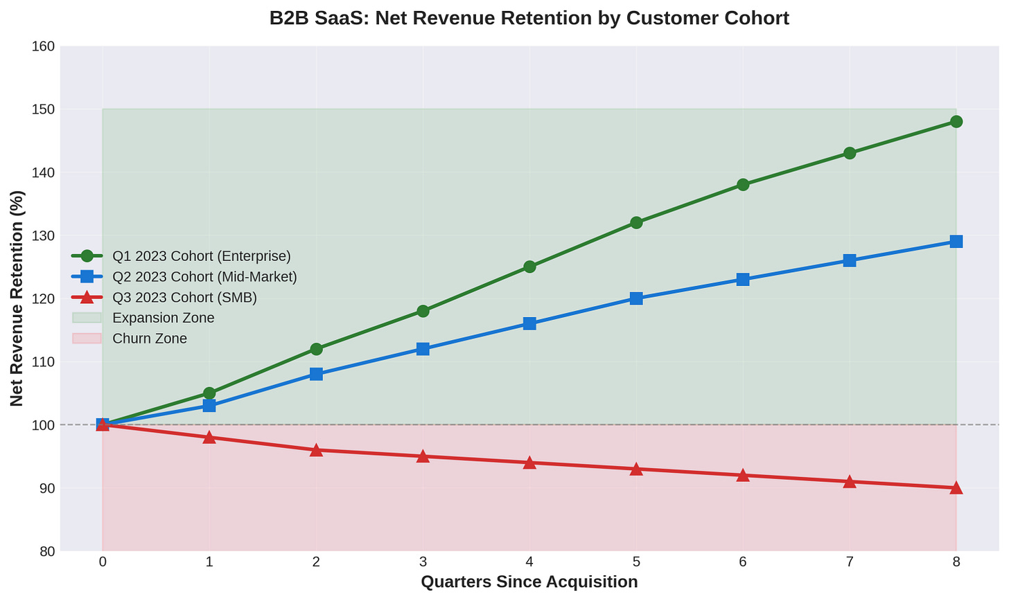
The Enterprise cohort expands steadily. The Mid-Market cohort grows more slowly. The SMB cohort churns, with revenue declining over time. This tells you to focus your sales and marketing on enterprise customers and fix the product or pricing for SMBs.
Just be careful not to cherry-pick your “best” cohorts. Survivorship bias hides fragility. The strongest segments prove their durability over multiple renewals.
2. Partner Cohorts: The Real Value of Your Channels (Crypto)
Which partners bring you the best customers? Not just the most customers, but the ones with the highest LTV. In crypto, this could be different wallets, exchanges, or influencers.
Crypto retention is notoriously difficult. One study of a DeFi protocol showed only 13% of new users were still active after two months [2]. This makes finding high-quality acquisition channels critical.
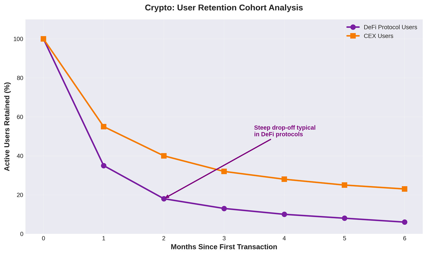
Here, users acquired through a centralized exchange (CEX) have significantly better retention than users who come directly to a DeFi protocol. That might suggest that CEX users are more committed or better educated. The signal is to invest in the cohorts that sustain engagement, not just those that drive sign-ups.
3. Market Cohorts: Where the Market is Pulling You (Ecommerce)
Are you seeing a sudden spike in adoption in a specific industry or geography? That could be a new regulation or technology shift creating a hidden opportunity. In ecommerce, segment by product category.
An Amazon seller on Reddit shared that they see a 30% repeat purchase rate in a 90-day cohort [3]. But this varies wildly by product type.
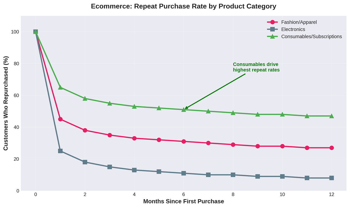
Customers who buy consumables (like coffee or vitamins) have a much higher repeat purchase rate than those who buy electronics. This may seem obvious, but quantifying it helps you decide where to focus marketing spend. The takeaway: prioritize markets where natural repeat behavior compounds.
How to Find Your Own Velocity Breaks
Ready to get started? Here’s a simple playbook:
Find Your North Star Metric. What’s the one metric that shows your business is creating compounding value? It could be NRR, user engagement, or repeat purchase rate. Start there.
Slice Your Data by Behavior. Don’t just group users by sign-up date. Group them by their first action, their acquisition channel, or the tools they use. This is how you find the why behind the what.
Use Modern Tools to See the Trends. Spreadsheets won’t always show you the compounding curves. Tools like Julius AI (a recent favorite), Equals, and Causal are built for this. They help you visualize the data & model the future.
Turn Data into Decisions. An insight is useless without action. If a partner cohort has amazing LTV, invest more in that channel. If a power-user cohort keeps hitting limits, create a new pricing tier. This creates a feedback loop where data drives strategy.
The Best Way to Predict the Future is to Analyze it
Cohort analysis isn’t just about looking in the rearview mirror. It’s about finding the leading indicators of where your business is going. The velocity breaks in your data are the whispers of the future.
By segmenting your customers, partners, and markets in new ways, you can spot these trends before they become obvious. You can find the hidden growth engines and make the strategic shifts that will define the next chapter of your company.
Don’t just report on the past. Use your data to design the future.
References
[1] Forbes. (2019). The Secret Behind Slack’s Runaway Success.
[2] Ocean Protocol Blog. (2023). Announcing the Winner of ‘User Behavior in DeFi Protocols’ Data Challenge.
Subscribe to Line of Sight for insights built for operators like us.


